Friday, June 27, 2008

What I've learned from art


Before this art appreciation class I knew nothing about art. I was completely nervous and had no clue what to do. I didn’t know what to look for, where to look or how to look. These past 8 weeks have flown by so quickly that I can’t believe it’s almost over. The material that I have learned will definitely help me to be more creative and to appreciate my beautiful surroundings. Last September my wife and I took a short trip to the Crocker Art Museum. I had a good time looking at all the paintings but I left wondering; what was I looking at? This week we made the trip again but this time I had a clue. The paintings seemed clearer and I was able to appreciate all the different types of art. I knew where to look for the true meanings of painting. My trip was a lot more enjoyable and I look forward to viewing much more types of art.
There were many different types of techniques that I have learned throughout this class but my favorite is where line space and color. Lines in pictures are amazing! Turning something into a three-dimensional takes time and thought. I am now able to figure out lines in paintings. I know what the horizon line is and where the vanishing point is located. Last week I visited my parents’ house in Lincoln, CA. They have several different paintings hanging on their walls. I asked my dad, “Have you ever really looked at these paintings?” He said no. So I showed him the different things to look for. I was able to show him the lines and tell him he had an abstract painting with a red hue. I told him why they chose two different colors on the color wheel opposite of each other to make the paintings intense. I showed him the overlap and why there was overlap. He was amazed at my newly acquired knowledge and wanted to learn more. After analyzing all the paintings in the house my dad had a good understanding of what he actually owned. One of my goals in life is to collect some different pieces of historic art, now I will be able to choose the pieces I like and interpret them. I am really glad I decided to take this class. I have learned so much in a short period of time.

Art Visit


For my art visit I decided to go to the Crocker Art Museum in downtown Sacramento. I have been to the Crocker Art Museum several times in my life. Last September my wife and I took a short trip to downtown and stopped by. Looking at all those paintings can mess with your head especially if you don’t know what you’re looking at. Back then I didn’t know what art was or what to even look for. I left the museum happy but unsatisfied! That trip actually made me want to take an art course at Sierra College, so I could learn what to look at. When I first read the course outline I was excited to learn we had to go visit a museum. I couldn’t wait to go back and re-evaluate all those paintings.
On June 24, I finally had a day off from work and school; it was the perfect day to go to the museum. I loaded up the car and prepared for the 30-minute trip downtown. I was a little nervous because I brought my wife and 8-week old daughter who always starts crying when she’s hungry, which is all the time! We packed an extra bottle just in case we had to do some damage control. When we arrived downtown the air was horrible. The northern California fires smoke blanketed downtown and the surrounding areas. For some reason downtown looked worse than Roseville. We got to the museum and paid for our tickets and I asked the receptionist what I could photograph. She told me anything that was part of the permanent collection.
We started out by looking at special exhibition, The Language of the Nude; Four Centuries of Drawing the Human Body. The exhibit was spectacular! The drawings were from the 16th through 19th centuries and were mostly from European countries. The lines on all the drawings were perfect and matched evenly. I could never imagine drawing or tracing that well. Most of the drawings were done with pen, chalk, or ink on paper. Next we decided to check out Tsakopoulos Gallery to view some contemporary art. My favorite painting in this gallery was a large acrylic on canvas done by a local man named Stephen Kaltenbach. The painting’s name was, Portrait of my Father, which took seven years to complete (1972-1979). If you ever get a chance to see this painting you will be amazed. The painting is a picture of how he saw his father before he died. His father was very sick and on the verge of death. Over his father’s face he painted a light blue design on top of the painting which gave it a hologram look. The colors matched perfectly and you can’t stop staring at it. After browsing the contemporary art we decided to check out the European art gallery.
I have always liked nature scenes which include mountains, streams and oceans. My favorite painting n this gallery was, Evening Shadows, Lake of the Four Cantons by Eugene Verboeckhoven and Jean Roffiaen. The painting was oil on canvas and made in 1862. The artist used raised brush strokes on the mountains to give them a sharp crisp edge. They also used lighter colors in the back to show distance also known as atmospheric perspective. My favorite thing about this painting was the details the artist used such as the little dog playing on the lower left hand corner. After an hour viewing different painting my daughter started crying because she was hungry. I didn’t want to interrupt anybody else’s art visit so we decided to leave. Viewing art in person is a lot better than viewing it on the computer screen or from a book. The computer screen doesn’t do the painting justice. The colors in person make the painting more enjoyable. I’m glad I got another chance to visit the Crocker Art Museum. I had a lot of fun and I got a chance to show my daughter some excellent paintings. In August I plan on going again to see an Andy Warhol exhibit which should be fun.


Tuesday, June 24, 2008

Conceptual Art


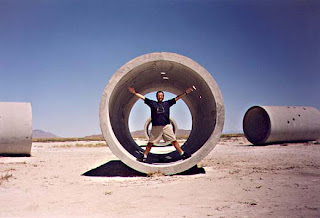
Before this class I have always liked conceptual art; I just didn’t know the proper terminology. Taking items that you see every day and transforming them into art seems very easy. I think most people like conceptual art because almost anyone can recreate some of the easier pieces. Also, the pieces don’t require a vast amount of artistic ability. I’ve seen conceptual art in books, museums, and friends homes. Every piece is so different. One of my favorite pieces of conceptual art this week was Nancy Holt’s sun Tunnels, Great Basin Desert, Utah. This art work can be seen in several different ways. To me it’s a sculpture and conceptual art. The concrete tunnels remind me of Roseville when I was a kid. My friends and I would ride our bikes near Woodcreek High School to the construction sites. There were huge concrete tunnels waiting to be installed. We would lay our bikes against them and climb to the top, the view back then was excellent. The Sun Tunnels design is so simple but brilliant. The picture with the light shining through the tunnel is my favorite because it reminds me of a symbol-like object. My favorite types of conceptual art consist of everyday house hold objects. Last year at the California State Fair, I viewed a piece that was made out of metal spoons. The artist welded thousands of metal spoons together to form a horse’s body. I don’t like all types of conceptual art though; I have seen pieces in the past that I thought were awful. Conceptual art will always be some of my favorite art. This class has taught me how to appreciate art and further expand my mind.

Two Worlds Collide

I hate to admit this but I would rather read a book with pictures. Pictures open your imagination and allow you to see things around the world you would never see. During my years in the Coast Guard I took pictures of my voyages. Those pictures will be with me for the rest of my life. When I see pictures for advertising I know they have been altered. A few semester ago in my English 1A class, I wrote a paper about advertising and altered images. While doing my research, I was amazed how advertisers manipulated pictures to make women and men more beautiful and sexy. After reading the lecture, The Collision of Two Worlds: The "Truth" factor of Photographic Images in a Digital World, I learned more about Digital manipulation. I was shocked to that a publication like "National Geographic" would alter its images because their images are world renowned. I've been reading the National Geographic ever since I was a young boy, the pictures in the magazine are images of real places around the world. Now I wonder how many of those photos have been fixed up? What doesn't really bother me about digital manipulation is the art side. Artists like Keith Cottingham, Aziz and Cucher's works have an artistic view point. They are not promoting the images as real. I don't feel there is an ethical dilemma when it comes to artistic photo manipulation. I don't particularly care for these styles of work but I do respect them. For example, Aziz and Cucher's Dystopia series freaked me out. Skin hanging over peoples eyes, ears and noses just doesn't please my eyes. The work is original though and the images look like they belong in a museum or art collection. These artistic type of photo manipulations do not bother me but advertising manipulation does. The evolution video on the Dove web page sums it up; all photos are fake. The business has no morals and it's all about the money. I don't let the images I see everyday affect me to a certain point. Of course when I see a billboard of the latest fashion it makes me feel like, wow that would be great to own. But I'm not looking at the model and admiring his touched up calves and arms. I think women have it worse than men when it comes to competing against digital photo manipulation. Especially young women ages 16-25. According to the world there suppose to be 5'6-5'1-, 100-120lbs and have permenant made-up fases. This stereotype will never stop because people want to be like this image, it's ingrained in their heads. I will remind my daughter when she's that age not to look at those pictures and ads and believe them!

Friday, June 20, 2008

My Favorite Painting


Before this class I never really had a favorite painting. My favorite type of paintings use to be landscape and nature scenes. Now I like drama and deep detail paintings that make you think about what your looking at. Last week my cousine Michelle told me the story behind Artemisia Gentileschi. She told me about her life and why she painted the way she did. Artemisia Gentileschi's father was a local painter in Rome in the 1500's. Back then women were not allowed to pain live nudes and were banned from certaqin academic institutions. Artemisia studied painting under her father because it was the only way a woman of her talents would be able to paint. Artemisia was a strong women and never accepted her constraints. Instead of painting portraits and still life she focused her efforts on subjects such as biblical and mythological characters where the women were the active characters. Artemisia's father's close friend Agostivo Tassi also taught her how to paint. But, when she was 19 years old he raped her. Once again, women were thought to be different and below men in society. Artemisia was humiliated for a long timebut never let the rape bring her down. My favorite painting by Artemisia is, Judith and Maid Servant with Head of Holofemes. The painting was ceated in 1625, they type of paint is oil on canvas. I love this painting because of the rich colors. Gentileschi uses the technique chiaroscuro, which uses deep shadows conflicting with dramatic spots of light. The painting reminds me of a scary scene in a movie where you know the killer is goingn to show up any minute. The painting itself shows Judith and the Maidservant stuffing Holoferus head in a bag. Holofences was Assyrian general who was tricked, then beheaded by udith, an Isrealite widow, who was trying to save her people. Artemisia shows the power of women in this painting because that's how her paintings were; women in heroic situations. Artemisia is an exellant artist and I lover her work. If you get a chance check her out on the web. I got the picuture of Judith and Maidservant, from Humanitiesweb.org.

Friday, June 13, 2008

Thomas Kinkade.....Artist?

I have always admired Thomas Kinkade’s painting because they look so peaceful. I’ve seen his paintings everywhere. I’ve been to the Kinkade galleries at several different malls throughout the country. I’ve even seen his paintings at the Military Base exchanges. I currently don’t own any Kinkade prints and don’t plan on it anytime in the near future. Before this week I knew nothing about Thomas Kinkade’s background. I always figured he was an excellent painter and good business man. After reading the blog prompt I was shocked. I immediately checked out the FBI investigation, Wikipedia and his website. The FBI investigation was interesting; slow sales at your retail stores and buy company shares at a reduced price, does this really happen in America? The article didn’t really make me a Kinkade hater, it just raised some questions. The people who sued him need to realize they made an investment, I don’t know the whole story but investments are risky. If in fact Kinkade did undercut their prices and made them sell prints that had slow sales, shame on Kinkade. In the end we all get what’s coming to us!
I do have a problem with the allegation that Thomas Kinkade uses the Christian card to real-in investors. Christians are known to be honest and hard working people who love the lord. In my personal life I’ve made sales by telling the customer where I go to church, it makes them feel at ease and that they can trust you. If Kinkade did in fact play this card, it’s very unethical. I did go on the Wikipedia website to look up information on Thomas Kinkade. In my opinion Wikipedia is only somewhat credible because anybody can put stuff on that website. How do I know one of Kinkade’s rivals isn’t on Wikipedia bashing him to reduce his sales? I was impressed by Kinkade’s charity work that he has done in the past for the Make-A-Wish foundation, and the Salvation Army. If you make lots of money you should help out the less fortunate.
Finally, I want to talk about Thomas Kinkade as an artist. To me he is an artist because he designs the prints and has painted in the past. To some he might not be a true artist and I would have to agree with them on some level. Personally, I will never have a Kinkade painting in my home because I believe they are overpriced. The point is people who buy Kinkade’s painting know what they are buying. I’m pretty sure they know Kinkade didn’t spend 18 hours on the print that is hanging in their hallway. Thomas Kinkade is a businessman who obviously knows what he’s doing. If I could make that much money I would sell prints too, but then again I don’t refer to myself as “Painter of Light.” I really don’t care if Kinkade sells mass amounts of prints because if there is a demand he should keep doing what he’s doing. But, I do hope his business practices are legal and ethical.

Friday, June 6, 2008

Analyze That!


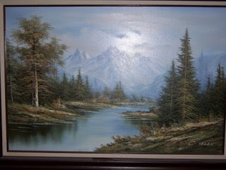
When I first saw this image I knew I had to analyze it. The scenery is so peaceful. I could stare at the image for hours and see so many different interpretations. I love nature images because they remind me that the world has so many different types of terrains. These images bring back memories of camping, hiking, and fishing with my friends and family. This particular image has beautiful colors, lines, and lights. The image's hue has many different colors. There is blue, light blue, white, green and brown. The relative value of the image is light in some areas and dark in others.
This image uses atmoshperic perspective, the image is darker in the front and it progresses lighter to show distance. The mountains appear to be further away along with the trees along the banks of the water. The artist uses implied lines, these lines focus your eyes farther down the water, like your looking for the end. Contour lines are used in the trees to show volume. The tree's are used as overlap to creates space behind them. The shadows of the trees on the water make the image look real because you would actually see those shadows in nature. You can really see the texture of the trees. Each tree has branches and leafs that stick out and come to life. You can also see the rigid texture of the mountain tops.
I really enjoyed this image, it makes me feel like I'm floating down a river in Montana.

Tuesday, June 3, 2008

Watch the Magic


I decided to take a picture with my Winchester Country Club 3-D hologram glass block that I got from a good friend. I display the glass block in my office near my other collectibles. The block is one of my favorite pieces, everybody loves it. If your a golfer in Northern California you know about Winchester Country Club. It's one of the top golf courses in California and the nation.
The glass block is clear with a 3-D image of Winchester Country Club logo etched into the middle of the block. When you shine light into the block it emits a rainbow spectra in the right light. Picture 1 was taken just before sunset, around 8pm. Picture 2 was taken at 11am the next day near the same spot. Picture 1 has a dark value unlike picture 2, which has a light value. Picture 1 looks like it was taken when it was dark outside. The image has no shadows and the sky is dark. Picture 2 has shadows, the image itself has a shadow and the surrounding background.
Picture one's hue has several different colors, light gray, dark green, and dark brown from the surrounding fences. The glass is also darker and less reflective. In picture 2 the hue is much lighter, there is light green, dark green, white and clear glass. You can even read the Winchester logo clearer. Picture 1 has more saturation than picture 2. Picture 1 has dark intensive green and dark glass. Picture 2 has a lighter, brighter saturation with white light green and clear glass.
My favorite image is picture 2 because it reminds me of playing golf in the the morning with my friends. Which one do you like?


Analyze This


Friday, May 30, 2008

Line and Space


I learned so much about line and space in chapters 5 and 6. After learning the material I see things differently. I have a painting in my house of Venice, Italy, I never really paid any attention to the linear perspective. Now I see the different lines and the dimension. Today I went outside and looked down the street, the car in the distance, the plants on the right overlap and create an illusion of space behind them. Another example of line and space in my everyday life is where I work, Carmax. The cars are lined up on straight rows. If you look on one side of the isle the end gets narrower. Now, I will pay more attention to the line and space around me. I'm excited to look at more art work because I have a better understanding of content, form, line and space.